We try hard to make our products as intuitive and familiar as possible, but there will always be “advanced” options and rarely-used features. Giving users choice and control over their experience will naturally lead to features that are used less frequently or settings that only a small percentage of users will change.
So how do we decide what order and prominence to give to these lesser-used features?
One method to help decide where (and how prominently) a control or interaction should be placed, is to classify interactions into one of three types:
Obvious, Easy and Possible.
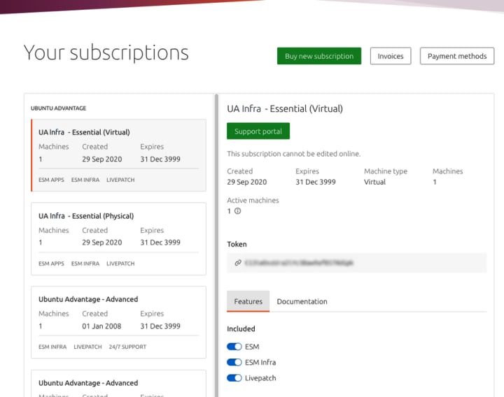
Let’s take a look at the Ubuntu Advantage user interface:

There’s lots going on here, so let’s look at the “Obvious, Easy, Possible” classification:
Obvious: Obvious interactions are the core function of an app, for example, the shutter button on a camera app or the new event button on a calendar app. They’re the functions that users will likely perform every time…


